


lotting the average of all the traces in a GPR cross-section shows the response character versus time and provides the user with insights and key understandings of the nature of the data.
GPR lines are commonly displayed in varying colors based on signal amplitude (Figure 1a). However, the best way to show trace data is by plotting the GPR data as a wiggle trace (Figure 1b). A wiggle trace plot depicts the amplitudes of the signal as deflections from zero amplitude.


To generate an ATA plot, all the traces from a GPR line are rectified (also called absolute valued) to remove the negative signal amplitudes and show all the signals as positive amplitudes (Figure 1c). Then, the rectified traces are averaged to a single trace (Figure 1d). The averaging of rectified data means that the noise and signals are all included in the resulting average.
ATA plots are usually plotted with the average trace on its side (Figure 2); time in the X direction and amplitude in the Y direction. Also, since there is such a large dynamic range in the GPR signal amplitudes, the average trace amplitude plot is usually plotted with a logarithmic amplitude scale.
- The plot can be used for assessing and quantifying random noise and the depth of penetration of the GPR signals
- Flat lying reflectors are emphasized; reflectors that dip or vary in depth are averaged out
- Coherent system noise which is time-invariant will show up in the ATA plot and can be diagnosed as such
- The plot shows if the GPR signals are being clipped off
- The decay curve of the amplitude with time is a good measure of ground attenuation
- The ATA amplitude decrease provides a guide to the appropriate time gain function to be applied to data
In this article, we focus on how to use the Average Trace-Amplitude (ATA) plot for a and e.

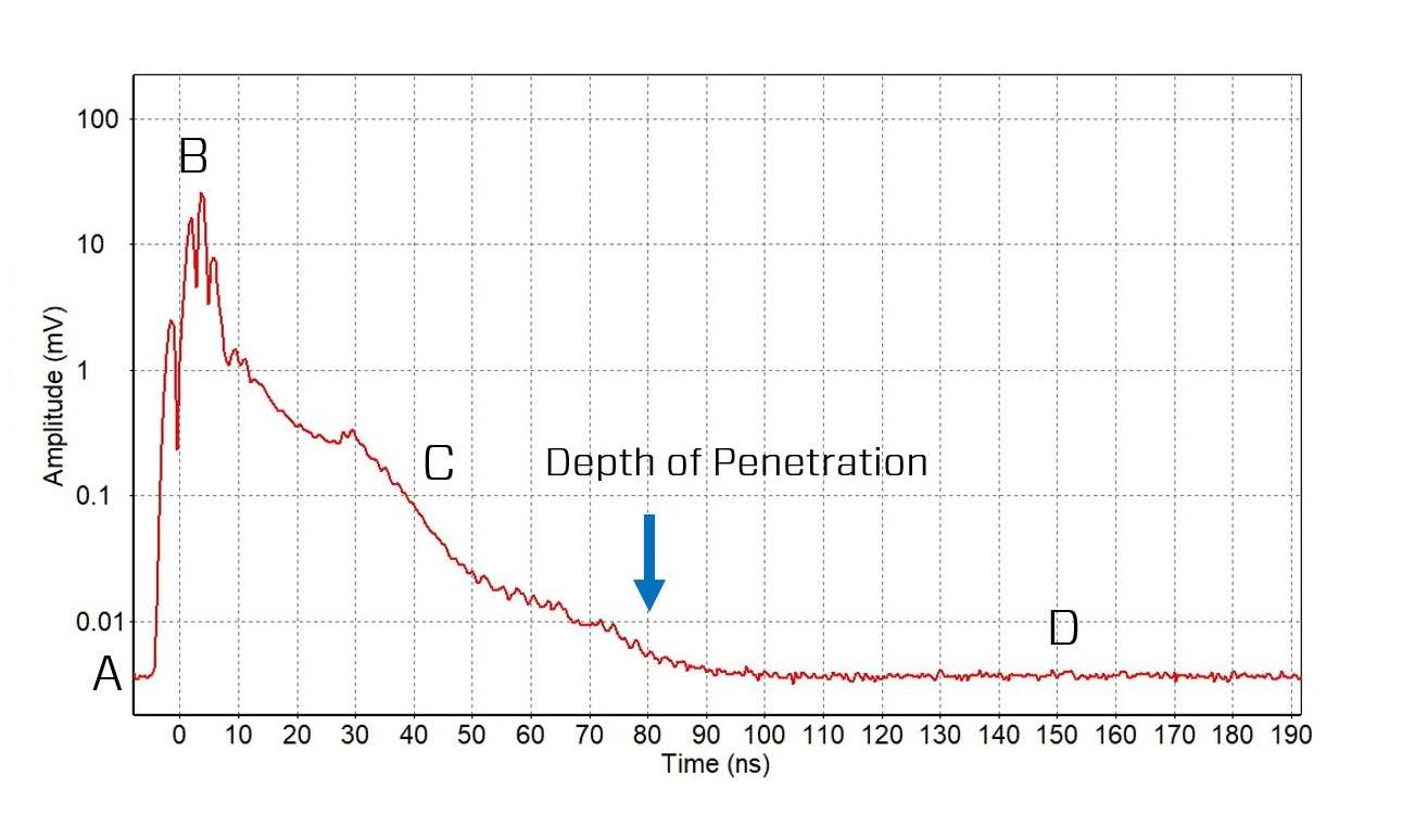
The GPR receiver begins recording before the GPR transmitter fires, resulting in only background radio frequency (RF) noise in the data (A in Figures 2 and 3).
After the GPR transmitter fires, the highest amplitude signal in an ATA plot is usually the direct arrival of the GPR transmit pulse at the receiver; this signal travels through air at the speed of light (B in Figures 2 and 3). This is called the “direct air wave”.
Following the direct pulse, GPR signals arriving at the receiver are weaker, as they have been attenuated after travelling through the subsurface. The further the GPR signals travel in the ground, the weaker they are and the later they arrive (C in Figures 2 and 3).
After all the GPR signals have attenuated, the receiver again records the background RF noise (D in Figures 2 and 3).

The depth at which GPR signals are the same amplitude as the background noise (so they can no longer be differentiated) is defined as the GPR “Depth of Penetration”; this depth of penetration varies based on the electrical properties of the material (Figure 5).
Background RF Noise
Before the GPR transmitter fires, the GPR receiver is recording other radio frequency emitters in its bandwidth (A in Figure 2). In the example in Figure 2, the background noise floor is approximately 0.004 millivolts.
Examples of ATA plots of 100 MHz data with background random noise varying from 0.03 to 2 mV (66x stronger) are shown in Figure 4. Background noise can vary tremendously depending on the RF environment – areas, usually urban areas, with many strong radio transmitters can generate signals 1000 times stronger than other, more remote or rural areas with few RF emitters.
High background noise reduces the depth of GPR penetration.

The ATA plots show that GPR amplitudes decay with time. Figure 5 shows extreme attenuation curves of 100 MHz antennas. The red line slopes very gradually, indicating low attenuation and deep GPR signal penetration. In fact, at 850 ns (about 45 meters), the signal has still not attenuated down to the noise floor; this means that the operator would have seen deeper if they set a longer time window. The green line shows higher attenuation, with the GPR signal rapidly falling into the background noise floor, indicating limited GPR signal penetration at this site.


